We begin a new series of articles dedicated to significant personalities in the field of design and architecture that are not specially well known. This first article is dedicated to two of the women who worked at the modern furniture firm Herman Miller, Tomoko Miho and Barbara Loveland. In the work of spreading their legacy, archivist Amy Auscherman and Hall of femmes‘s editors stand out, as well as journalist Meg Miller and designer Adrian Shaughnessy.
The Coconut chair, Ray and Charles Eames’ leather lounger: the furniture design in the 1940s and 1950s experienced a moment of splendour that left unforgettable examples. New materials and manufacturing techniques, such as moulded wood or plastic; the consolidation of a new taste for living spaces; the liberation of customs and new forms of urban life; the optimism of the moment; all this gave rise to historical designs that changed the way we understand our everyday spaces. In addition, the company was concerned about spreading its work with an excellent graphic design that won hearts.

George Nelson Inc., designed by George Mulhauser. “Coconut” Chair, 1958. Brooklyn Museum. Image via Wikipedia Commons.
Herman Miller: laying the foundations of modern design
One of the great design firms of the time was undoubtedly Herman Miller. Founded in 1905 in Michigan under the name Star Furniture Company, Dirk Jan De Pree, who had become president, and his father-in-law Herman Miller, bought 51% of the shares in 1923. The company, at the time, reproduced models of existing furniture. But the advent of the Great Depression renewed the role of design, making it necessary to develop new products that would stimulate the market. For this reason, Herman Miller hired designer Gilbert Rohde, whose role was key in forming a modern American style in the first half of the 20th century.
Rohde experimented with innovative materials, such as Plexiglas, and designed one of the first modular office systems, the Executive Office Group (EOG), which Herman Miller brought to market in 1942. But he was not alone in consolidating a new image for Herman Miller. While his office designed the furniture collections, his wife Peggy Ann Rohde designed and illustrated catalogues, brochures and other graphic elements of the company.
Later, in 1945, George Nelson became Herman Miller’s Design Director. Nelson was editor of the Architectural Forum, believed that a designer’s role was to improve the world in which he/she lived, and had special qualities for interdisciplinary work. Ray and Charles Eames, Harry Bertoia, Richard Schultz, Donald Knorr and Isamu Noguchi worked for the company under Nelson’s supervision. In his own studio, Nelson pioneered the development of the corporate image as a total design. The company’s graphic design also became an iconic example of mid-century style. The logo was developed by Irving Harper, whose design for the Marshmallow sofa we certainly acknowledge. When Harper began working on an advertising campaign for the company in the 1940s, there were no photographs of furniture available to include, so he designed a picture that would later become the company’s logo.
Tomoko Miho: clarity of Japanese influence
In addition to these remarkable collaborators, Herman Miller welcomed the talents of others whose role was fundamental even though it is less well known. Archivist Amy Auscherman is currently working in the company’s archive and among her objectives is to identify the contribution of women to the firm’s artistic legacy, as Meg Miller reports in Eye on Design. Auscherman had previously worked on in-depth research into Miller House, a modern masterpiece whose architectural design was carried out by Eero Saarinen, its interior design by Alexander Girard, and whose garden furniture was expressly commissioned to the Eames. Ausherman is also co-editor of Phaidon’s Herman Miller: A Way of Living.
Returning to Herman Miller’s archive, as a result of her work, Auscherman rediscovered several designers who collaborated with Herman Miller. One of them was Tomoko Miho, a Japanese-American designer who contributed exceptional labor to the graphic presentation of Herman Miller. Writer and designer Adrian Shaughnessy, in his fantastic article on the designer, argues that Miho’s catalogues of the 1960s were a major influence on the graphic presentation of furniture design internationally.

Catalogues designed by Tomoko Miho while working for George Nelson. Image: Herman Miller Archives
Miho was born in 1931 in Los Angeles. Her family spent some time in a concentration camp after World War II. She studied at the Art Center College of Design in Pasadena. Afterwards, she traveled to Europe, where her contact with modern art and architecture had indelible impact on her. On her return, Irving Harper, creative director in George Nelson’s office, hired her. The combination of clarity and formalism of her graphic proposals assured her work an unquestionable functionality and beauty. Precise and detailed, her designs are clean and clear. Her use of perspective is characteristic, as in the case of the logo developed for Omniplan in 1971.

1964 Catalogue designed by Tomoko Miho and George Nelson. Image: Herman Miller Archives
After four years in Nelson’s office, she moved with her husband to Chicago, where he had found a new job. She would start collaborating in the Center for Advanced Research in Design (CARD) directed by John Massey. At CARD, Tomoko continued to work for Herman Miller. She also produced her most famous work, the Chicago Architecture posters, now preserved in New York’s MoMA, in which she used the image of an industrial material to reflect the spirit of the city.
In 1982, she founded Tomoko Miho Design in New York, where she continued to produce her work, which can be known in greater depth thanks to the book Hall of Femmes: Tomoko Miho, which recovers her trajectory.
Barbara Loveland: psychedelic inspiration
In the 1970s, Herman Miller hired graphic designer Steve Frykholm as his first creative director and in-house graphic designer, of which his explosive designs for the annual Picnic stand out. In 1976 and 1977, Linda Powell and Barbara Loveland joined the team. Rob Hugel would do the same in the 1980s, and that’s how the graphic design department of the 1970s and 1980s was formed.

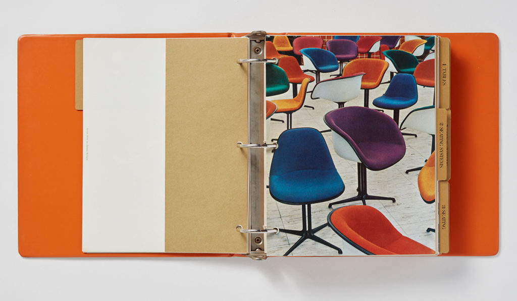
Facility Management Seminar Packet. Barbara Loveland, 1981. Image: Herman Miller Archives
Loveland was born in Michigan in 1951. Both she and Powell graduated from Western Michigan University (WMU) in the 1970s. After graduating, they worked at the WMU Design Research Center in the Art Department, where they met. Both were involved in some exciting work, including a full review of the company’s graphics of seating and systems in the early 1980s. Before the arrival of computers, that meant airbrushing the entire product line by hand. After being employed by Herman Miller, Inc. for thirteen years, she became Communications Design Manager. She later moved to Ferris State University, where she developed a four year degree in Graphic Design.

C-forms Poster Series. Barbara Loveland, 1979. Image: Herman Miller Inc.
Most of the work they did was internal, leaving aside some of the work for advertising or aimed at the public. However, their quality and optimism was fascinating. In the case of Barbara Loveland, the posters reflect a world of colourful, seductive and cheerful forms, with undeniable influences from the psychedelia of the 1970s. Her work includes Herman Miller’s folders, boxes and stationery in the unforgettable red color that characterizes the firm. Loveland created a pattern of red dots on red with the name of the company.

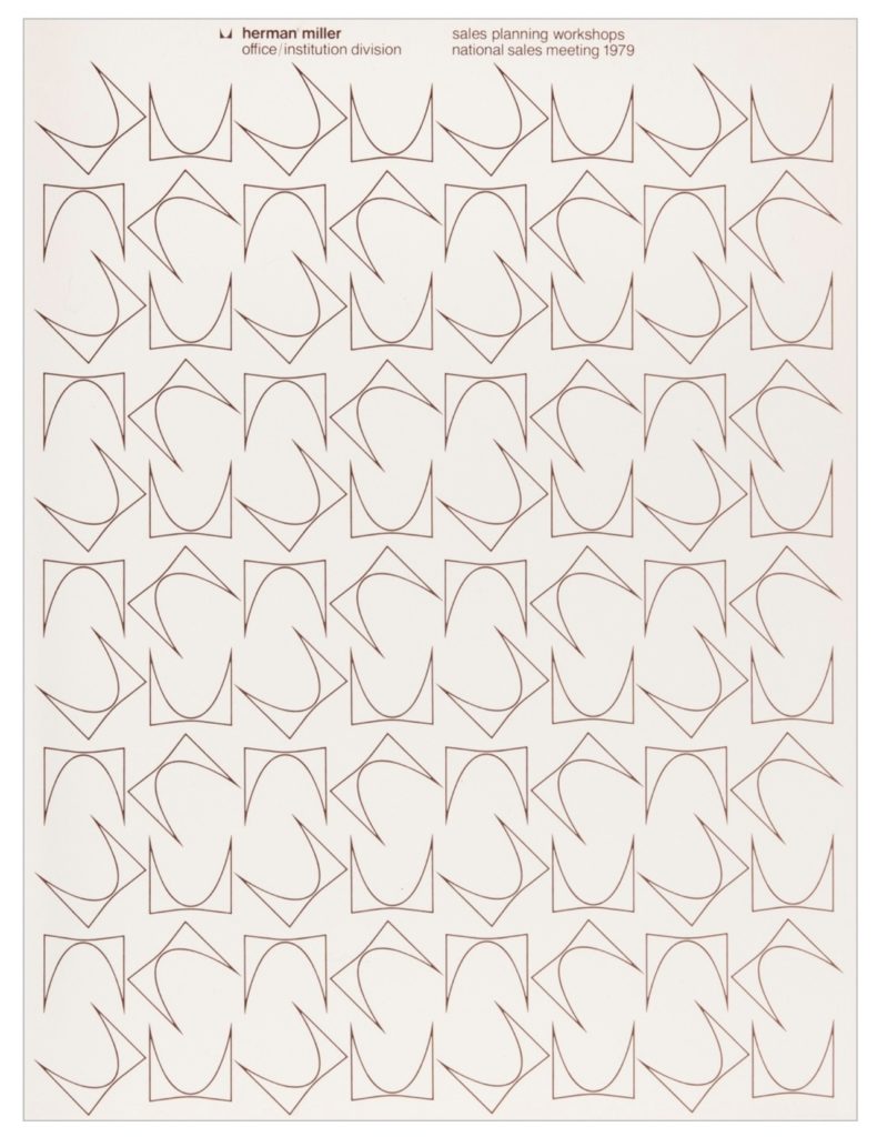
Herman Miller 1979 Sales Meeting Packet. Barbara Loveland, 1979. Image: Herman Miller Inc.
Powell and Loveland, in recent years have devoted much of their time to founding and maintaining the West Michigan Graphic Design Archives, in order to preserve the history of this discipline in the region.

Leave a Reply